Next time you’re in San Diego for a few days, stop by Snooze for breakfast. They’ve got a couple locations in town. Or if you’re in Tempe. Or Boulder. Snooze has about 7 locations in total.
![]() They offer a great experience and menu. Breakfast pot pie. Green Eggs ‘n Hamwich, Pineapple Upside Down Pancakes. The Banana Nutella Situation. Delicious stuff.
They offer a great experience and menu. Breakfast pot pie. Green Eggs ‘n Hamwich, Pineapple Upside Down Pancakes. The Banana Nutella Situation. Delicious stuff.
But let’s talk for a minute about what makes their website good, so you can learn from them in attracting people to your independent restaurant or small-chain brand.
Then we’ll also offer some suggestions on what would make their website great.
Here’s what makes the Snooze Eatery website good
Snooze nails several aspects of restaurant website design. Let’s break down 6 factors that Snooze gets right:
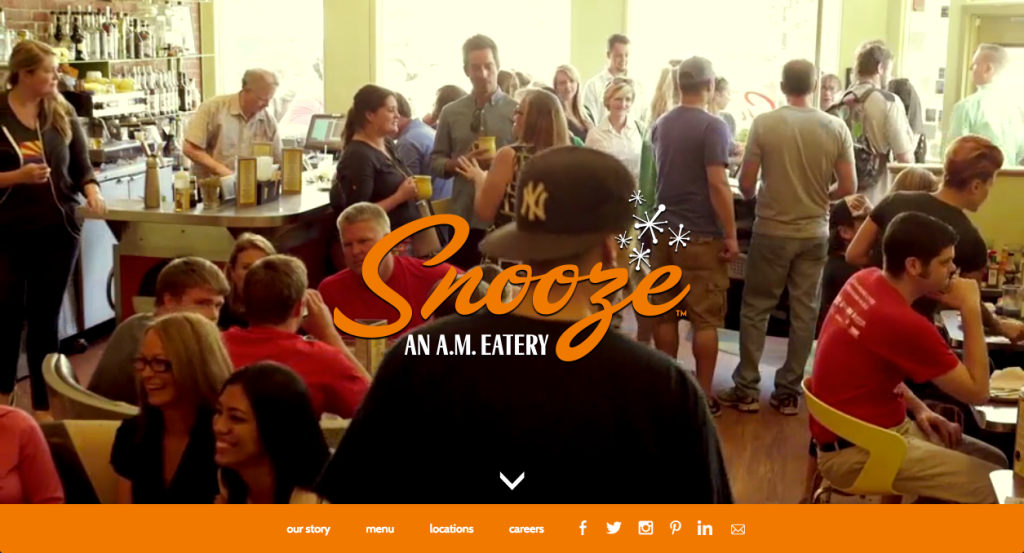
1. Snooze gets the power of a simple home page.
I’ve captured a screenshot of it, but you’ve got to see it to fully appreciate it. That’s no image. That’s a video. And you get an immediate feel for the vibe.
It is a busy restaurant/diner even on weekday mornings. Great natural light. Cool, retro booths. And you instantly get that when landing at the site.
2. Snooze’s site is mobile-ready.
Check it out for yourself on your smartphone or at Google’s mobile test site. It loads fast and it offers all the most pertinent navigation links (our story, menu, locations, and social links).
That great video I just told you about? It doesn’t appear on mobile screens, and that makes sense. No need to feature it for mobile viewers and it chews up a bit more bandwidth.
3. Snooze features fabulous food photos.
The photos of menu items are incredible. Perfect zoom selection. Outstanding lighting. Check it out:
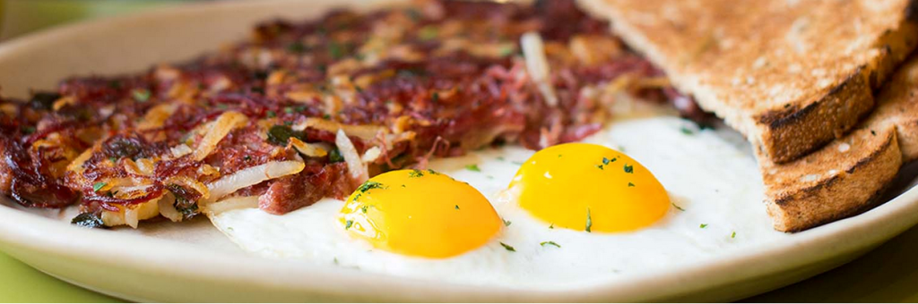
My screenshot doesn’t do it justice because that sucker is full screen on their site. Visit the page to see for yourself. Makes you want their food. Badly.
4. Snooze gets the people side of the restaurant business.
It’s one thing to tell people your restaurant experience is focused on people. It’s another thing to show up. Not a tucked-away gallery where poorly-taken photos reside. Snooze puts great photos right on the home page, as you scroll down.
Staff having a great time. Guests enjoying themselves. Real photos, but in HD.
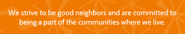
5. Snooze features its values.
Are you attracting the type of customers you want? Be bold: show in a straightforward manner the values you stand for.

If you really feel strongly about those values, why not feature them on your site?
6. Snooze knows social networks mean social proof.
Snooze doesn’t just dink around on Twitter, Instagram, Pinterest, and Facebook. They’ve got a solid following on each of those social networks.
Beyond linking to those networks, though, they take a page from Salem Roberts’ lesson plan and embed snippets from Twitter, Facebook, and Instagram right on their restaurant website.
Here’s what would make the Snooze website great
Notwithstanding a great restaurant website design, there are six things from both a user experience and search engine standpoint Snooze should incorporate to get their restaurant website from good to great:
1. Feature your reviews.
Several Snooze locations have outstanding Yelp reviews. I’d absolutely feature these on the site.
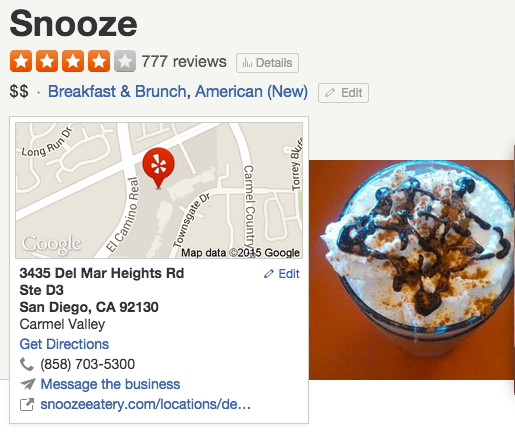
Snooze built their restaurant website on the WordPress platform. Very smart. And there’s a free plugin (with a Pro version) that would make it easy for them to embed specific reviews on their site.
You should do this too.
2. Make your menu prices visible.
This is a tough one for a multi-location restaurant brand, let alone a chain. Snooze may very well have different prices in different markets, or a frequently-changing menu, but when you’ve captured me via mobile, especially, you can surely suck me in to visit if I know what to expect with pricing.
You can use a platform like OpenMenu to do this.
3. Get that blog going.
 Snooze has a placeholder for a future blog, but there’s nothing there yet. Let’s get rolling with that.
There are so many things a unique, small brand or independent can do with their blog to attract the types of customers they want. In this case, Snooze already has a good story to tell.
4. Show your location details.
Snooze really drops the ball with this one. It’s very difficult to even click on their map to see the four pins that appear to be in Colorado, to see those locations’ addresses.
It’s crucial to make it very easy for website visitors to take action. The more you make them work, the more frustrated they get, and the more likely to click the back button they are.
5. Larger navigation icons on smartphones.
The navigation links and email icon on the Snooze website are pretty small when viewing on a smartphone. I don’t have fat fingers and I couldn’t tap the exact social icon I wanted to on my first two tries.
Always test the design of your site for a variety of users and platforms. Android phones, iPhones, men, women, big people, small people. It won’t slow your process down that much.
6. Where’s your email signup??
There is currently no way to join the Snooze Eatery email club. Or, it appears, there isn’t one. We’ve talked about this many, many times here at NextRestaurants.
The email icon on the mobile version of their website merely starts a blank email to the team at Snooze.
Massive missed opportunity!
What else could make the Snooze website great?
I will tell you now that it is badly missing the boat from a technical optimization standpoint for SEO. Which is a shame because they do have the Yoast SEO plugin installed.
But what else would you do their website to make it great? With only a breakfast and lunch crowd, should they add online ordering and feature that at the site? (I don’t think so.)
Should they replace that Careers link on the main navigation with something more important to customers? (I DO think so.) Gift cards, their catering details (holy smokes those are hard to find at their site), their Schwag link — there are several that would be better choices.
Should they add even more menu item photos? Feel free to comment below or touch base with us via Twitter.