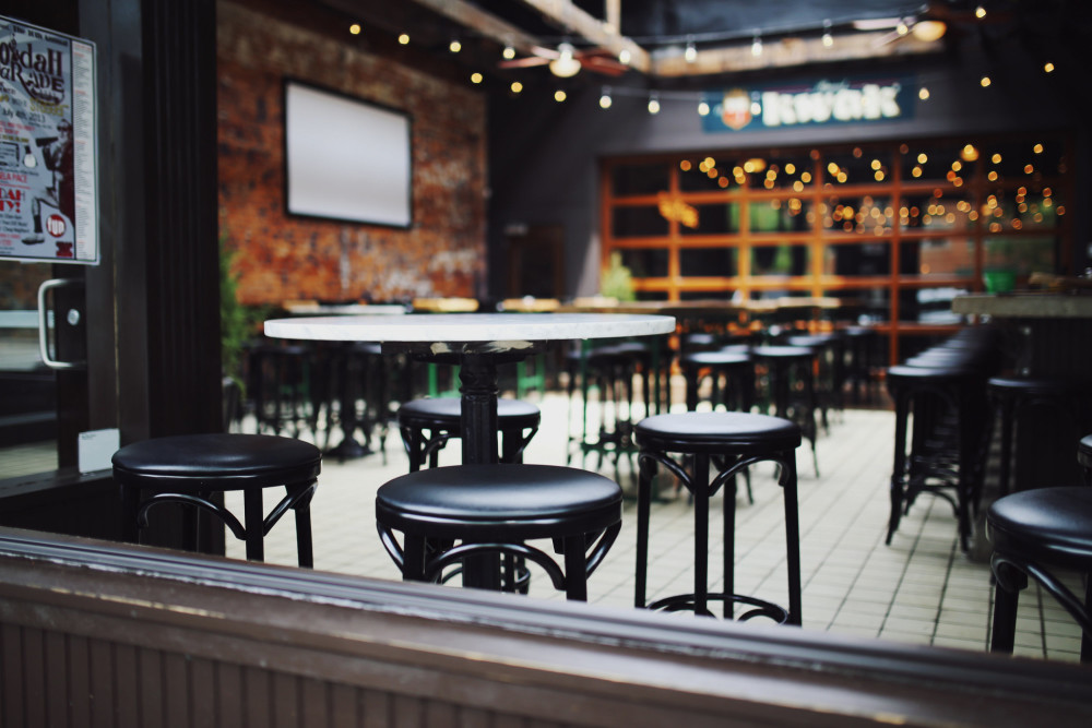
It pains me to say this, but in the digital marketing world, restaurant websites have a reputation for being among some of the worst from a user experience and optimization standpoint.
They’re often either too bare bones to share the information that potential patrons want to see, or victim of an overzealous web designer eager to show his bad-ass Flash skillz.
The best restaurant homepages usually fall somewhere in between those extremes — erring on the side of restraint, but still eager to please the visitor with the information and options they need to make a dining decision.
With that balance in mind, let’s dive into the elements your restaurant website’s homepage should include to make sure it does both your business and your visitor the most good it possible can.
1. Recognizable Branding
Your restaurant’s name should be clearly displayed so the visitor knows they’re at the right place. Branded elements — your color scheme, logo, fonts, the overall template — will help reinforce that to your visitor. Just be sure not to overdo it with a hokey template, or worse, one that’s distracting for the visitor. Simple and understated is what you’re going for.
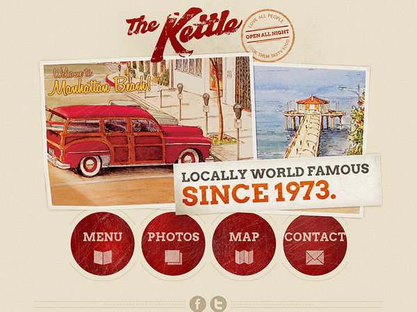
By way of example, take a look at The Kettle‘s homepage. There’s a distinct brand displayed through their font choice, logo, and template — but it’s not so overwhelming that a visitor is distracted from taking a next step on the site.
2. Easy-to-Find Menu
If a site visitor is still in the research phase, they’re likely looking to do some recon on your menu. Make it easy to find through a large, clear visual callout on your homepage. You should also add it to your navigation, a common place for site visitors’ eyes to naturally drift.
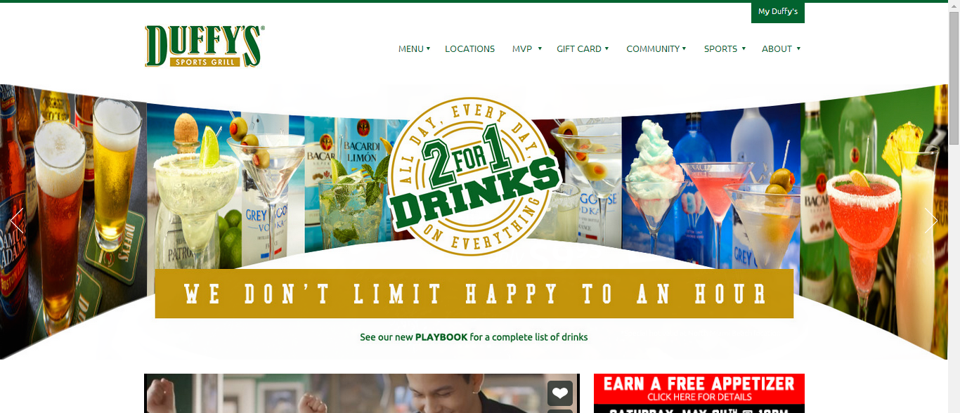
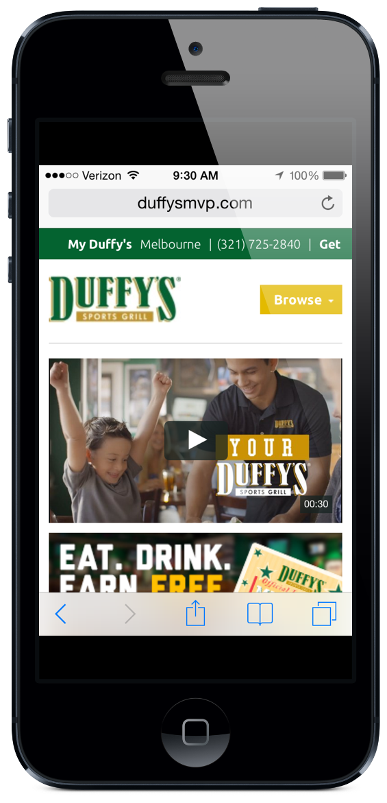
Check out Duffy’s MVP, a sports bar chain based in Florida. The menu is their very first option on the main navigation at the top.
3. Clear Reservation Information
If your site visitor isn’t in the research phase, there’s a good chance they’re on your site to make a reservation. Just like your menu callout button, there should be an equally visible reservation callout on your website’s homepage, as well as in your website’s navigation.
(Tip: To help move site visitors along in their decision-making process, include a reservation callout on your Menu page, as well. Once visitors are done looking through your menu, you should make it as easy as possible for them to take the next step to get into your restaurant.)
4. Hours of Operation
A small addition but an important one — days and hours of operation clearly marked on your homepage are critical for people’s decision-making process, and cuts down on disappointment for people that assumed you were open on a day or time when you’re not. Plus, if it’s easy to find on your homepage, it can cut down on calls to your restaurant asking what time you’re open 😉
5. Comprehensive Contact Information
Contact information serves a few different purposes — which is why you should provide a comprehensive list of ways to get in touch, including physical address, phone number, and email address.
- Physical Address: This makes it easy for people to plop your address into Google Maps. You can even add an actual map to the homepage if you feel like overachieving.
- Phone Number: Obviously, a phone number’s important for a quick way to get in touch.
- Email Address: Restaurants that provide an email address may make their lives easier (and that of their hosts and hostesses) by giving customers a place to get in touch for non-urgent matters — like inquiries about renting out a space for a private party, for example.
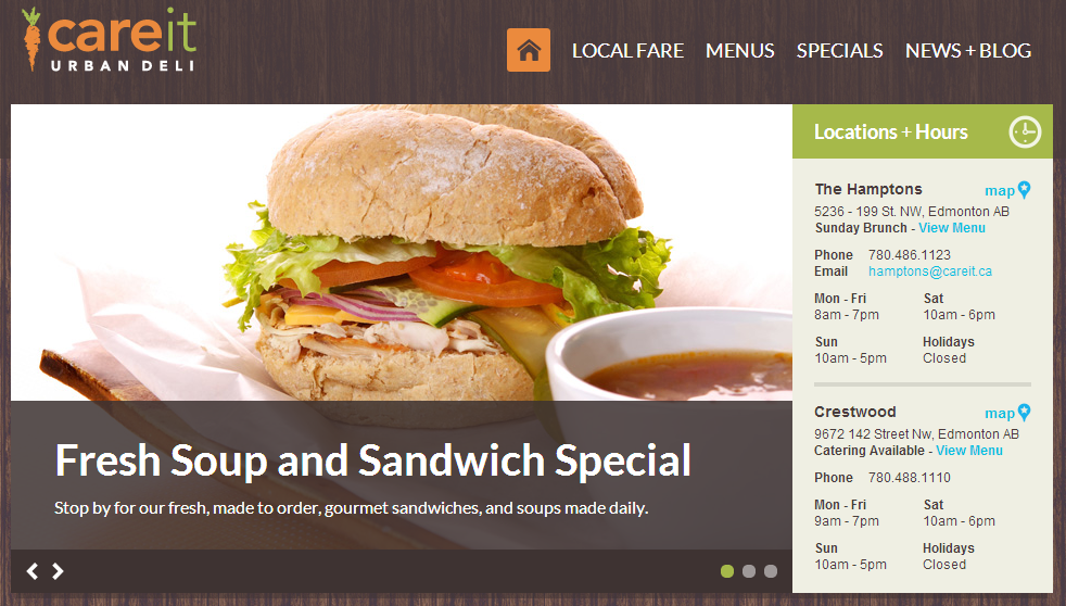
I like the way Careit Urban Deli groups their contact information on their homepage — take a look.
6. Intuitive Navigation
I’ve mentioned the navigation a couple times, but it’s critical — your homepage should have a navigation that highlights the most critical elements site visitors might want to find. I’d recommend adding (in no particular order) “About,” “Menu,” “Reservations,” “Blog,” “Events,” and “Contact Us.”
You might have other nav items you want to add — for instance, if you have multiple locations, and “Locations” tab would be a good addition. But try to keep the navigation relatively uncluttered, just highlighting the critical items people will search for.
7. Fast Load Time
One of the most common elements I see on restaurant website homepages is Flash, huge images, and other fancy elements that, while really cool looking, really impede the functionality of the site — for both readers and search engines.
Make sure your web developer optimized for a fast load time so it’s easy for all viewers to see and use your homepage. If it doesn’t load quickly or search engines can’t read it, you’ll suffer a high bounce rate and no indexing.
8. Social Follow Buttons
Finally, make it simple for your customers to follow you on your social channels — Facebook, Twitter, Pinterest, Instagram, etc. Some people might use these as a research tool to see if others enjoyed their experiences at your restaurant, while others might use it to spread the word about your restaurant and stay up to date on menu changes, events, and other goings on at your establishment.
Adding these icons to your homepage makes it easier for both of these groups to get the information they need, and helps you widen your social reach. It’s a win-win.
9. Responsive Design
The best way I can think to describe responsive design is a website snapping into place. That means if someone viewed your website on their desktop computer, and then picked up their iPhone to view it a few minutes later, the website would look equally good on both devices, because it’s responsive — the images and text have adjusted to fit the screen on which they’re being viewed.
This is critical for your website homepage because guess what … a lot of your customers will be checking you out on the fly. Which means they’re checking you out on mobile. Again, we go back to Duffy’s MVP for an awesome example of this.
Check it out — this is an actual screenshot we took and placed in an iPhone wrapper (NO EDITING):
As a side note, check out their menu. It’s fully mobile-optimized:
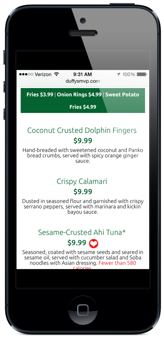
Instead of setting up an entirely separate mobile site for your restaurant to achieve mobile optimization, just build a responsive website. You’ve gotta be mobile optimized whichever way you slice it, and responsive design is far easier to implement and maintain than building a separate mobile site.