Email promotions are a critical component of effective restaurant marketing strategies. While they’ve been pivotal in the evolution of marketing as a whole, including outside the restaurant industry, emails are less effective when constructed in the same, old-fashioned manner as before.
Think about this: Email clients have even adopted SPAM folders just to handle the amount of ineffective, hard-sale promotional emails that now flood inboxes.
With the advent of SPAM folders and a growing numbness to business emails, it’s harder than ever to reach your customers and prospects via email. Even more so, it can be near impossible to actually engage these users to make your email promotions an effective advertising tool.
While we’ve got a lot working against us, it’s important to note that even small restaurants can benefit from a well-executed email campaign. Take a look at some of these statistics from Benchmark on what your competition is doing:
- 57% of all restaurant email campaigns are issued at a monthly frequency.
- Almost one third (32%) of subscribers are patrons who have actually visited the restaurant venue, with fully 38% being subscribers signed up through a variety of promotions.
- 60% of restaurant marketing emails consisted of mixes of informational factors with various forms of discount vouchers or coupons.
In the restaurant industry, we’re lucky to have a few extra tools in our arsenal to help boost the efficacy of our email promotions. Still, many miss some of the crucial tips when crafting their email campaigns. Perhaps the most important statistic to note is that…
Only 18% of restaurants are currently engaging in email marketing campaigns.
Are you part of the 18%?
If so, are you really capturing the maximum amount of leads possible with your strategy? Let’s take a look at 4 crucial reminders before you send out your next email promotion.
1. Get Visual with Your Email Promotions!
Have you ever received a promotional email without images? In all likelihood, the answer is probably ‘no’...especially in recent memory. The fact of the matter is that we as humans are highly visual creatures, and companies that send out promotional emails know that sending a plain text message is simply ineffective.
As restaurant owners, you’re lucky in that our ‘product’ is an extremely visually-appealing item! You have the benefit of social media on your side already (Instagram, anyone?), but many forget that those same tactics can be brought into the realm of email marketing as well.
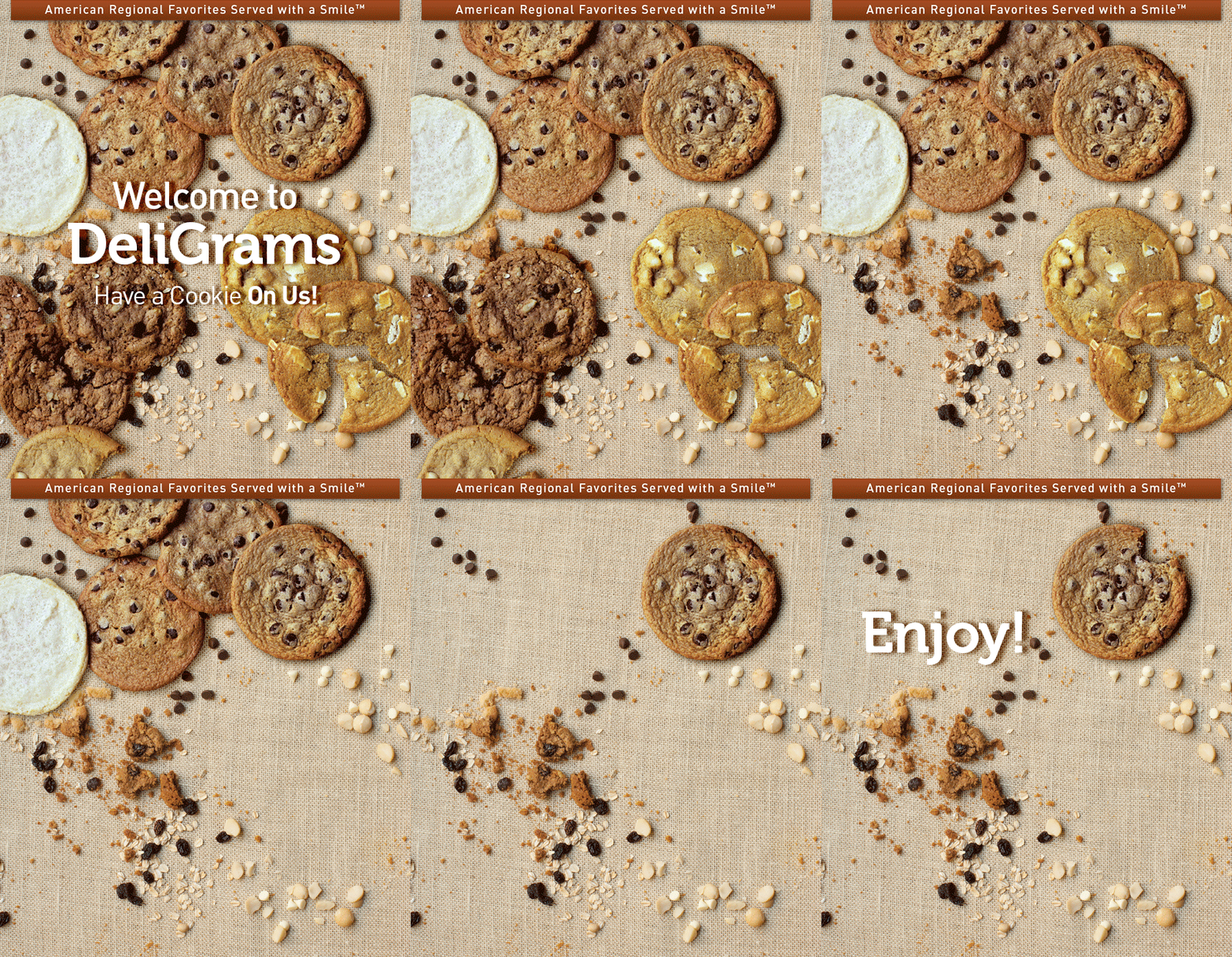
Check out one of McAlister’s Deli’s latest marketing emails, offering viewers a free cookie.Instead of using a still image, McAlister’s used a gif, (aka) graphic interchange format, toengage the viewer. It’s fun, eye-catching, and enticing. Who doesn’t want a cookie after seeing this?
This can be broken up into two steps...
Step 1: Get an arsenal of high-quality images in your database of some of your best-sellers.
Step 2: Hire a graphic designer! Even if it’s just on an ‘as-needed’ basis, it’s important to invest in the help of someone who can craft visual emails. Otherwise, you’re spending all of your effort and time in an email campaign that can turn out sloppy and, ultimately, end up filtered into the virtual trash can.
2. Use Call to Action Buttons.
If you’re not familiar with this term, it’s time to get acquainted. Calls to action (also known as CTAs) are what directs users to participate further.
They literally call the viewer to act. This could mean sharing on social media, inputting their information, or clicking a link to take them to your website or an ordering page.
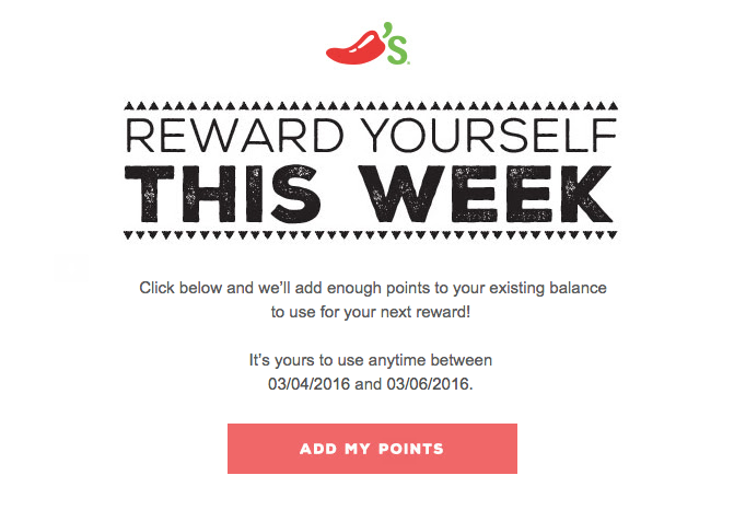
In the image below, Chili’s’ CTA calls viewers to “reward themselves”, adding points to their account to redeem a reward.
Your CTAs help guide users as to what to do next. Otherwise, you risk ‘orphaning’ your email, leaving guests with the option to either simply discard the email when they’re finished or to invest more time and effort into further pursuing what they want on your website (which is highly unlikely to happen).
Don’t just tell them what to do -- Instead, utilize ‘buttons’ like the image above where users can click and be directed to a different page. They look clean and crisp, and you’re likely to gain more traction with a visual button as a CTA.
Remember, one of the most important CTA buttons could very well be the ‘subscribe’ button to keep them in the loop with future emails.
3. Vary Your Content.
Hard sales have gone the way of the dodo bird, so to speak. Rarely will somebody buy a product because they were pitched a ‘hard sale’ through email. Here’s what the industry is doing for their email content:
3 out of 5 (60%) use content that mixes informational factors with various forms of discount vouchers or coupons.
Emails that were exclusively informational in scope were responsible for 16% of all sends. Emails that were directly focused on sales and discount coupons without any notable informational content accounted for nearly one quarter of the total at 24%.
So there are a ton of ways to go about varying your content, but you want to keep in mind that the ‘sales’-type emails should be kept to an absolute minimum in order to retain your readership. People want humor, discounts, and useful information. Put a personable ‘voice’ in your emails, and you’ll have better luck connecting with prospects.
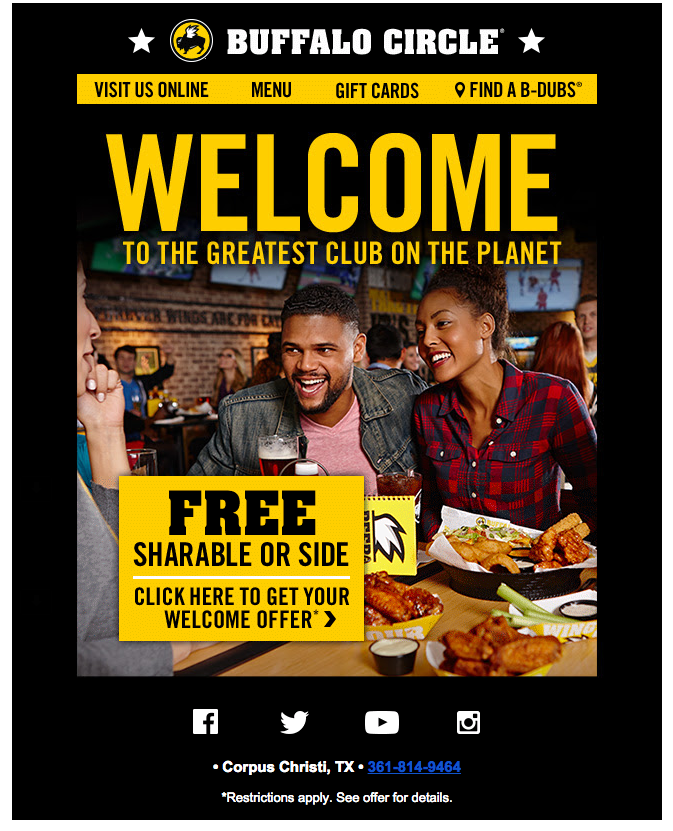
In the image below, Buffalo Wild Wings is welcoming the viewer to the “Buffalo Circle”, which offers members exclusive deals and promotions. Buffalo Wild Wings uses a clear company image and voice that harkens to casual conversation, while also offering a free appetizer.
In another example displayed below, Panera Bread uses a completely different strategy when sending their welcome email to MyPanera members, the brand’s rewards program.
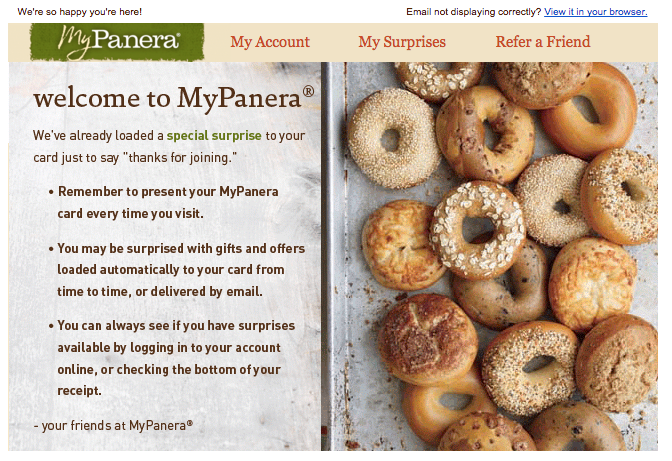
Rather than pushing a promotion or free offer on the viewer, Panera sends a simple welcome message,detailing how the viewer should use their MyPanera card.
Both Panera’s and Buffalo Wild Wings’ emails are clear and to-the-point. They share a common theme, welcoming new fans and promoting their bands. However, one is pushing more of a direct sale, while the other isn’t pushing a purchase on the viewer at all. Together, they demonstrate the ideal email marketing strategy: variety.
4. What’s in Your Subject Line?
Even the most interesting email can get shoved to the trash can before it’s ever opened if the subject line is dull, boring, or simply too pushy. Before you send out your next email promotion, take a close look at the subject line. It’s the ‘first impression’ of your email, and it can leave a sour taste if written improperly.
Because so many of us today check our emails on our phones, it’s important to keep that in mind when crafting your subject lines. Most mobile devices will only display 24-26 characters,which means your space for a catchy subject line is limited.
Take a look at the subject line that McAlister’s used to introduce the cookie email displayed under “Get Visual!” above. It’s short. It’s sweet, literally. And, it pushed me to open the email on my iPhone.

These subject lines need to initiate further reading of the email, so this is the time to pull out your punchy one-liners. Don’t send the generic ‘SPECIAL OFFER’, but instead prompt quick engagement with ‘Special Offer to Our First 100 Readers’ or ‘Are we friends yet?’ if you’re looking to boost your social media numbers with an email linking to your profiles. Be alluring, intriguing, and irresistible -- all under 25 characters.
Your email promotions can be highly effective in garnering new traffic and retaining old customers. Make sure that you’re utilizing these four crucial reminders before sending off your next email campaign:
- Use Visuals
- Use CTAs
- Vary Your Content
- Pay Attention to Your Subject Line
The payoff is higher readership and potentially higher sales. Customers today don’t want to feel like they’re being pushed into buying something with a generic, impersonal email.
Take the time to craft emails that speak to your customers that are different from competitors.
Email promotions are an essential piece to the marketing puzzle. You’re able to connect with old customers, expand your brand awareness, and provide useful content to partners as well. Unfortunately, many restaurant operators still use traditional forms of email promotion, which can break apart the chain of brand loyalty they’ve worked so hard to earn.
To get the most out of your next email marketing campaign, don’t be afraid to mix things up, incorporating visuals, catchy subject lines, and calls to action to speak to your viewers on a more meaningful level.

