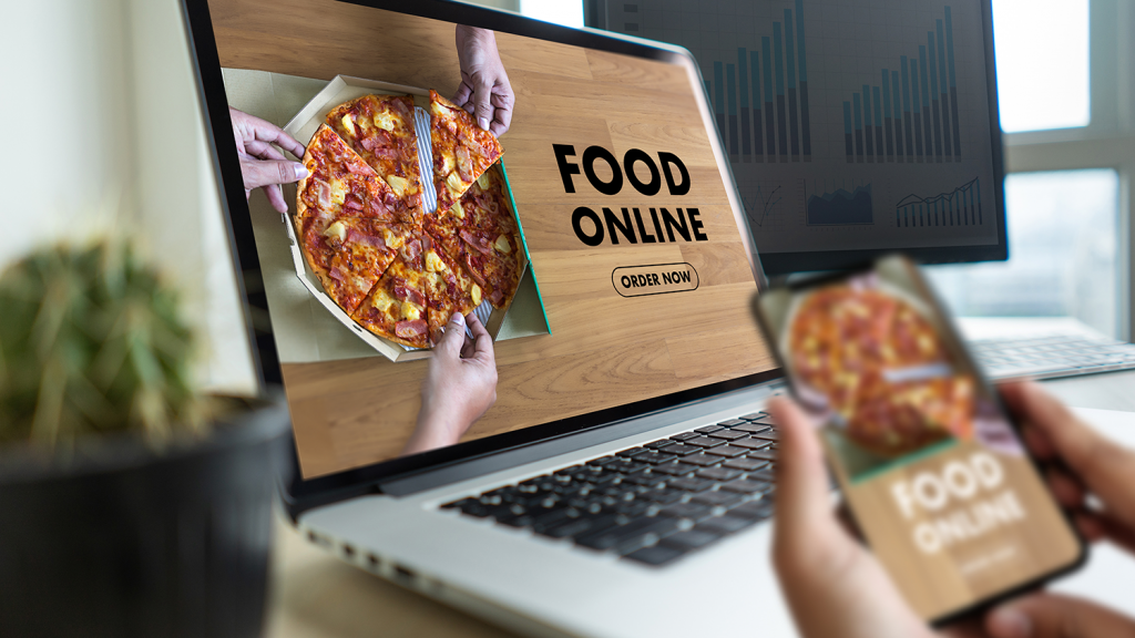
Did you know that 90% of guests research a restaurant on the internet before visiting it?
What’s more, 57% of these folks view the restaurants’ websites before choosing the one they should visit. In other words, if a new customer arrives at your doorstep, they most likely found out about you on the web.
So, what made them choose you over the others?
Sure, it might be about the reviews or the type of food you serve, but your website’s design also plays a critical role in influencing the visitors’ decisions.
In fact, 48% of users consider website design as a primary factor when judging a business’s credibility. When it comes to ordering food online, website design is that much more important.
That said, let’s take a look at a few web design tips that will help you boost sales.
1. Optimize for Mobile Devices
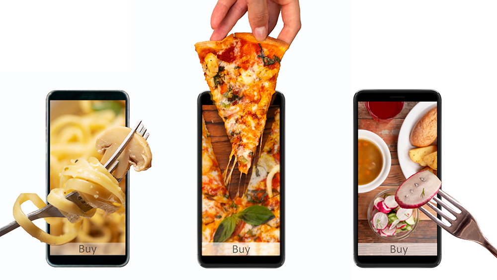
Mobile devices account for 60% of all digital restaurant orders. In other words, having a mobile-friendly website is a must.
Moreover, given that mobiles generate 54.4% of web traffic, Google prioritizes mobile-friendly websites when ranking them on the Search Engine Results Pages (SERPs). In other words, having a mobile-friendly website is a must.
To do this, you’ve got a few options available. You can either opt for a mobile-first, adaptive, or responsive design.
If most of your audience uses mobile devices, it’s best to go for the mobile-first approach.
On the other hand, responsive design might be the better option if you’d like to maintain a consistent user experience across all types of devices.
If you’d like to keep the desktop version as is and work on a separate mobile version, you should choose the adaptive approach.
However, note that each approach has its own pros and cons. That said, consider consulting with a professional website design company before deciding.
Speaking for mobiles, note that 53% of users will abandon a web page if it takes longer than three seconds for it to load. Sure, going mobile-friendly will help you optimize the loading speed, but you should take a few more steps.
For instance, as you’ll place many images on your website, they’ll likely slow it down.
You should compress your images before uploading them to your website, as that will help cut out any unnecessary weight.
Other page speed optimization tactics include reducing the number of redirects, enabling lazy loading, choosing the right hosting provider and CMS platform.
2. Choose a Minimalist Design
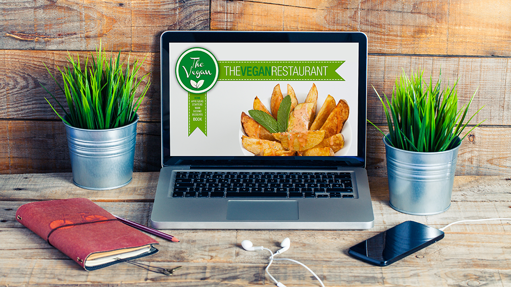
In the world of web design, less is more. The less clutter there is on your web pages, the easier it is for users to navigate your restaurant’s website, and the more likely they will be to stick around and maybe place an order.
That said, keep your design elements to a minimum and eliminate any unnecessary distractions that might drive the visitors’ attention away from where it’s needed.
Also, make effective use of whitespace. This is the space between your website’s design elements. You wouldn’t want to make your website look like it’s glued together, as that can hurt your site’s scannability.
Instead, you should put some space between your images and fonts. This will only give your website some breathing room and enhance legibility.
Whitespace can also help draw attention to critical parts of your website, like your photos, or the special deals section of the web page, for instance.
3. Invest in Photography
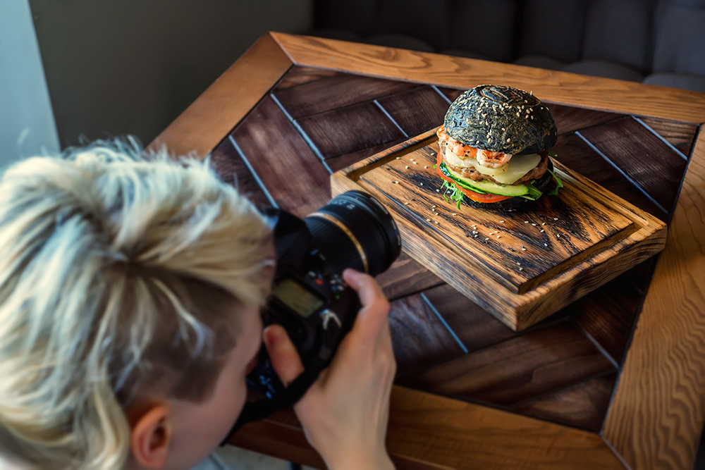
Although taking photos of your restaurant and food by yourself might seem like a good idea, as it’s cost-effective, hiring a professional photographer may be worth it.
Like with eCommerce stores, photos play a crucial role in making an excellent first impression on the visitors.
Your restaurant’s food needs to be displayed in the best way possible, so it will look appetizing and convince visitors to place an order.
Moreover, quality photography will help your brand stand out from the rest.
Through composition, styling, and lighting, photographers can take photos of your restaurant that align with your brand’s identity and leave a lasting impression on your audience.
4. Optimize Your Online Menu
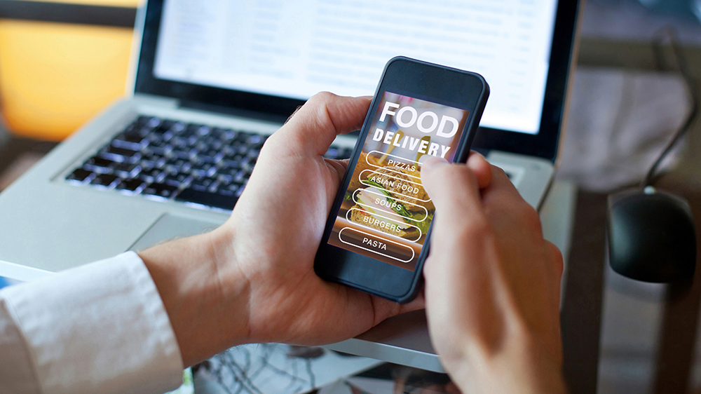
Your menu can either make or break the deal, as that’s what your customers will look for before placing an order or booking a table.
Firstly, avoid having a PDF menu. Given that most users will visit your website via mobile devices, the last thing you want to do is require them to download a PDF file. Furthermore, Google can’t index PDF files. Consequently, your website will not rank for keywords representing the food items on your menu.
That said, your menu should have a dedicated web page. This enhances user experience and boosts your website’s SEO.
Secondly, add menu categories (e.g., Starters, Main Course, Vegan, etc.) for improved navigation. Also, your menu item descriptions should be short, straight-to-the-point, and include high-quality photos.
Lastly, you can give customers the ability to customize their dishes, as this is an excellent opportunity to drive upsells.
For instance, you could provide users with the option to order larger dishes or add additional toppings for a fee.
5. Test, Measure, Improve

Lastly, don’t forget to make regular design tweaks and see whether they influence your sales.
For instance, you could tweak your messaging, the placement of your menu items, the offers or discounts you display on the website, switch between colors, change the placement of buttons, etc.
You can use Google Optimize to run tests on your website and examine their effects. But remember to change only one thing at a time to get a more accurate idea of what’s working and what’s not.
Final Words
Having a mobile-friendly website and optimizing loading speeds is a crucial first step in boosting online orders.
Also, make sure your site is clutter-free and clear of any unnecessary distractions that may drive the users’ attention away from where it’s needed.
Furthermore, invest in high-quality photography and optimize your menu for ease of use.
And lastly, continuously tweak your website’s design to see where there is room for improvement.

