Your restaurant customers are often on the go. And when they are, they’re searching for restaurants more than any other category of brick and mortar business.
How easy do you make it for them — if it’s your website they hit up first — to get the info they need and make a decision?
If you haven’t yet embraced converting your website to a responsive website (and I’m stunned at how many of you still haven’t done this), you’re way behind the curve. Most of us simply can’t read the details on your desktop-friendly website when viewing via mobile. The fonts are too small. The page is too wide. The images are goofed up.
Oh, the humanity.
By the way, with the outstanding work of Phil Baylog, NextRestaurants is a fully responsive site. Looks great on your desktop, looks and works great on your smartphone.
Here are 6 great examples of mobile restaurant websites
(Update: We previously stated these sites are responsive. They aren’t all responsive, by definition. They are all mobile-friendly, however, and still great examples.)
Okay, so maybe “copy” is a strong exhortation — you shouldn’t LITERALLY copy others’ websites. How about “emulate”? In this post, we share 6 responsive restaurant websites you should emulate, along with the reasons why they’re great.
Right off the bat, let me tell you this: Google is moving closer and closer to penalizing you in their search results if your site is NOT mobile friendly. Call it unfair. Call it heavy-handed. But you need them more than they need you.
At first glance, notice how easy to read each of these five sites is? You’re looking at screenshots I took with my iPhone 4S. Nothing doctored, changed, edited, Photoshopped. Definitely not images the restaurants or their developers gave me.
1. Donatos
Search.
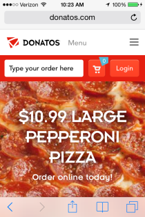
Finally, a QSR website that recognizes the huge opportunity for consumers to INSTANTLY find a menu item and order it. Donatos has nailed the “quick service” concept via mobile.
Important features to highlight: that search box is unreal. You don’t tap Menu, then Entrees, then Pizzas, then add Pepperoni, then select Large. You literally type “large pepperoni pizza” and boom, that menu item is right there.
Now, hold on to your Buckeye hat there, greenhorn. Not only does the customer NOT have to tap 5, 6 or 8 times to get to that pizza, but she doesn’t even have to then add it to an order and then go review the order. It’s instantly added to her order when she taps on it from the auto-suggest.
Amazon hasn’t even mastered this.
You then enter your contact details to get that pizza in the oven for you.
It’s the fastest mobile ordering solution I’ve encountered and it’s brilliant. And it was built from scratch by Donatos’ agency.
I challenge you, restaurant website developers, to think about a search box as a key element of your design. NO ONE IS DOING THIS. Except Donatos and Dynamit, obviously.
 2. Jack in the Box
I know, right? You didn’t expect to see a major, major brand here? And yet.
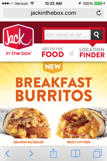
The Jack in the Box app isn’t flawless, but it’s solid. It loads extremely fast, gets to the heart of the matter instantly — Food, Location, and Deals — quickly — while it also asks you for permission to identify your current location to speed things up.
You can interact with the brand on that home page as well — check out new menu items, join the E-club, watch a video, but it doesn’t feel weighed-down like many restaurant websites.
Where Jack in the Box excels just like Donatos is in how well the mobile site mimics the desktop website, too. They’re duplicates, so if you’re really a fan of the brand, there’s no learning curve. Order from home and the experience is very similar to ordering on the go.
 3. Arby’s
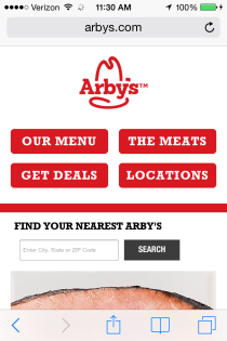
Much like Jack in the Box, Arby’s has a laser-like focus with its primary navigation: Menu, Meats, Deals, Locations.
See, what you’re learning here is that brands that “get” mobile design first “get” the scenario in which a consumer is discovering them via smartphone — ON THE GO.
You’ve got to focus. You can’t tell the whole brand story. You can’t expect a customer to tap 8 times just to add an item to their order.
And for Arby’s the focus on “The Meats” is brilliant, as it mirrors the latest branding campaigns by Arby’s to get consumers thinking beyond fast food when they think of Arby’s, and instead of viewing them more as a premium, fresh deli destination.
 4. Cold Stone Creamery
You could argue that the Cold Stone Creamery mobile website isn’t sexy, like Donatos. But you know what it is?
Useful.
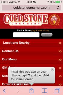
Logo. Find a Store. Navigation.
No messing around with fancy elements that could take forever and a day to load. If you take a look at my screenshot, it’s the most important elements in that navigation, again.
Another aspect of Cold Stone’s mobile website that I like is the prompt to “install” the web app onto your smartphone.
I believe that the average consumer is not going to go ACTUALLY install multiple restaurants’ apps. It bogs down their phone.
But they MAY be more willing to bookmark a link to a restaurant’s mobile website by following a prompt to do so.
 5. Duffy’s MVP
About 30 locations, folks. We’re not talking a megabrand. And yet Duffy’s has done a great job of delivering a mobile experience.
Clicking “Browse” gives you quick access to the navigation: Menu, Locations, MVP Card, Gift Card, Contact.
Better than any of the others mentioned here (and many others I checked out), Duffy’s makes it fast and easy to purchase gift cards via smartphone. Everything fits right there on the screen.
While they’ve added a video on that home page that can help give you a feel for the brand, it works here because Duffy’s is a sports bar as much as it is a restaurant. Everyone wants to know what a sports bar is like before going — the environment, the energy level. When you play the video, it fits on the screen and it’s short.
Not a bad site at all to emulate. And it was built on the open WordPress framework (like NextRestaurants), if you’ve heard of it — powers about 20% of the world’s websites now and is extremely easy to manage a site with.
 6. Islands Restaurants
Once again, look at the navigation: Food, Bar, Locations, Tiki Link.
That fourth link is to their E-club. While I don’t think it’s important to feature that as part of the mobile experience, it doesn’t slow things down.
One think I like with Islands’ mobile site is the location feature. Take a look at the bottom of my screenshot. Rather than make me select a location or enter my zip code, it guesses the closes location. That’s a faster experience for the mobile consumer.
Now, in this case it got that location wrong. There’s an Islands in Temecula, California, where I was when snapping that screenshot. But we won’t pounce on them for that.
You’ll also note the upper right-hand corner. “Order Take Out”. Nice job of featuring that. They’ve got Aloha Online Ordering, so it’s a POS-integrated solution built right into their mobile website to take orders. Great job on this from an Operations standpoint as well as Marketing.
Summary
There are many great lessons from these 6 responsive restaurant websites. Okay, 5 if you remember Cold Stone’s is redirected, not responsive.
- Clean, readable design.
- Simple navigation.
- Quick access to food (not a multi-tap, drill-down menu).
- Quick access to locations.
- Quick ordering.
Let me know if you’ve got some great examples you’d like to share.


