What is the #1 goal of your restaurant’s website?
Not every restaurant should deploy online ordering, despite my recent comments about the importance of “omni ordering.” Not every restaurant should heavily promote gift card sales. Or seek reservations. Those are dependent upon your concept and service model.
But when it’s all said and done there’s only one real goal:
The goal of your restaurant’s website is to increase sales.
It’s not about simply gaining attention or enticing people to enjoy your brand. It’s about converting site visitors into paying guests.
Chadwick Martin Baily partnered with SinglePlatform on a study that drops these stunning stats on us:
- 92 percent of consumers have search for a restaurant through a web browser in the last six months
- 75 percent say they often choose a restaurant to dine at based on those search results
Now, over the last year, I’ve viewed thousands of restaurant websites to see how well they’re designed and drive marketing results. I’ve seen the future of restaurant websites, and here it is:
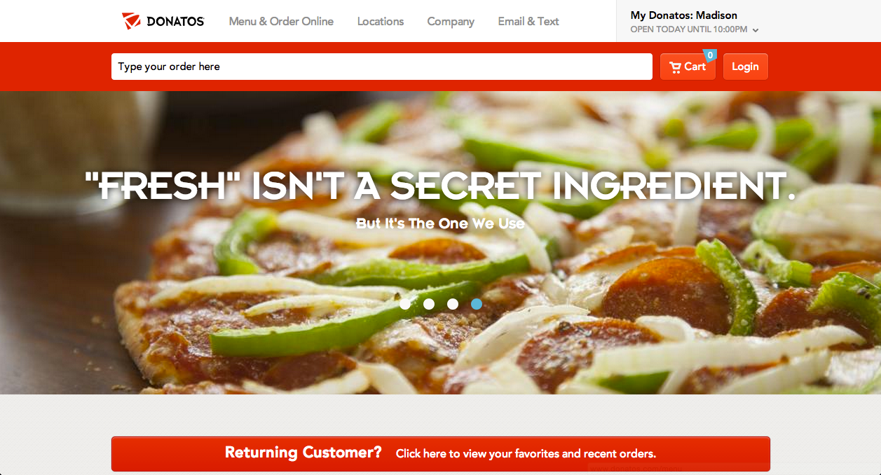
Donatos.com
And now I’m going to tell you why, because no matter your concept or model, there are five great lessons to learn for the future of your restaurant’s website.
1. The speed of your site is crucial.
Pull up the Donatos.com site on your desktop or laptop, as well as your smartphone. It loads extremely fast in every instance I’ve experimented. Chrome browser, Safari browser, even good old Internet Explorer. Mac. PC. On Wifi. 3G. LTE. In Ohio. In California (that’s all I’ve got as far as locations to test, personally.)
Whether you like it or not, you’re now living in high-speed Internet time. The days of your site taking 15 seconds to load are over. It’s now or it’s never.
It doesn’t matter that your restaurant is an in-demand, reservation-only, highbrow destination. Your average check size should not be proportional to the amount of time it takes your site to load. It needs to be fast. And the fact that you can build your site affordably and spend a measly $30/month to host that website and have it load with blazing-fast speeds means you’re not off the hook for any reason on this.
Speed is the key.
As opposed to the B2B world, where people may browse corporate websites to learn or educate themselves, consumers visit a restaurant’s website with high intent: to order, to reserve a table, or to get just a bit more information in order to decide to visit your restaurant (or not).
Make sure your site is well-optimized for speed, without bogging down the process.
And finally, speed has two elements: the speed of loading your website, and the speed with which a consumer can get an order placed. You should be measuring both of those in terms of time, and the latter in terms of number of clicks.
2. Blend your menu and your online ordering.
With an overwhelming majority of restaurant websites that offer online ordering, the menu is over “here,” and online ordering is over “there.” Even with the award-winning Five Guys website, the menu link is really useless.
What’s the point of clicking on Menu, only to see a list of items that are available, when you’ve got to then click Online Ordering to start actually building your burger?
There’s no need for displaying your menu, and offering an online ordering version of your menu. Now, this article is entitled The Future of Restaurant Websites, so clearly I realize that your options are limited as far as how to go about deploying it this way currently, but I’m telling you, that’s where you need to be thinking.
Donatos had a tech-savvy, restaurant-savvy agency named Dynamit build their platform. They specifically opted against choosing an off-the-shelf online ordering partner.
Matt Dopkiss, CEO of Dynamit, says this: “We wrote it on a wall. Ridiculously easy. We wanted to make it so simple for people to go from visiting the site to converting to place an order.” They nailed it.
But let’s say you never want to offer online ordering as an option, for whatever legitimate reason. If a consumer has gone to the effort to navigate to a specific menu item, or to peruse your menu online, that still signifies real intent.
What are you doing to capitalize (and convert) on your website visitor’s intent?
3. Emphasize search…with a twist.
Simply start typing in a search at Google.com and what happens? Autocomplete. Instant recommendations appear to make it faster for you to complete your search.
Start searching for a product at Amazon.com and what happens? Instant recommendations appear that you can then select from without ever hitting the Return/Enter key on your keyboard.
Start typing “large pepperoni pizza” at the Donatos site and you won’t even get through the word “large” before seeing recommended menu items. It’s highly likely that a large pepperoni pizza is going to be the first recommendation, too.
But here’s the game changer. Know what happens NEXT, when you actually tap on that recommended menu item? It’s added to your order already.
Skillz.
Donatos makes the assumption that if you’re looking for it, you want it. It’s a supremely smart assumption.
Staci Hausch, Digital Marketing Manager at Donatos, has this to say about the site, “We wanted people to be able to get in and immediately start ordering items. Conversion rate is one of the top things we pay attention to. People can order from anywhere on the site, and either check out as a guest or create an account to remember their recent & favorite orders. But first and foremost, you’re able to add things to your cart without having to tell us who you are. We’ll even recommend a store to order from for you to save you time.” (Emphasis added.)
Search is virtually non-existent for the majority of restaurant websites, let alone a primary feature of the home page, and it makes no sense.
Let’s say it’s 11:00 a.m. and I’m on your site, wondering if you have gluten-free ANYTHING. It should be clear to you as a marketer what could (or should) happen next if I see your menu has what I want.
Yet, for most restaurant websites: a) There’s no search feature, and b) Even if there was I couldn’t order that item after spotting it…until I navigate to the ordering section of your site.
4. KPIs: Think like an e-commerce marketer and track conversions.
What did Staci say about how they measure the effectiveness of the Donatos website? It’s about conversions. Do you track this occasionally? Donatos tracks it daily.
Donatos has seen a 100+% increase year over year in new customer orders online. And yes, they offered online ordering previously. Their biggest goal this year (aside from increasing that conversion percentage) is the percentage of digital orders that are online.
Yes, Donatos is a pizza chain. It’s the one restaurant segment that can absolutely count on and drive this sort of ordering mindset. Not every restaurant segment can pull this off. Yet, there are lessons to be learned here either way.
For example, every restaurant I subscribe to via email (and that numbers in the hundreds) pummeled me with gift card purchase offers during November and December. Yet, this is the worst section of every restaurant website. It’s slow, requires a ridiculous number of clicks, and undoubtedly results in frustration for customers who can often buy gift cards for the major chains in supermarkets, anyway.
Change your thinking when it comes to your website. Think conversions, think item suggestions, and think about reducing the number of clicks.
5. Market your website obsessively.
If I were running a restaurant brand today, I would see there being two (and only two) destinations that I should obsessively send consumers to: my stores and my website. Forget Facebook, forget Twitter, forget Instagram.
Why do I say this?
Because I own my locations and I own my website. The rules for using and leveraging Facebook change monthly. Twitter has adapted over time as well. And even though Instagram really hasn’t changed much since it launched, I don’t own any of these three.
I call them outposts.
Your website is your territory. You own it. And if your aim is to get better about converting website visitors into either online orderers, online gift card purchasers, or online table-reservers, then you need to send more people there, and NOT just to one of your stores.
There’s another reason to market your website obsessively. Two years ago, a Hooters regional VP told me that he felt increasingly his locations’ biggest competitor during football season wasn’t the other sports bars in their area. It was the grocery store down the street, combined with the consumer’s own 60” TV-screen living room.
Know what grocery stores don’t do well? Allow for quick ordering and takeout for group orders, events, and catered business lunches. Your website is the weapon to fight against them as well.
Donatos.com represents the future of restaurant websites.
You may not be able to duplicate specific aspects of how Donatos attacks the market. But you can learn from how they’re approaching the single most powerful, owned destination outside of your restaurant’s locations.
Speed. Menu/ordering integration. Search. KPIs. And marketing your site more effectively. Those are the future.
Kudos to Donatos (and Dynamit).
What do you think? Agree or disagree?


