This is the third post in our series comprising The Beginner’s Guide to Restaurant Email Marketing. View our first post on getting started here, and our second post on selecting a vendor here.
We’ve talked about your email marketing template in a prior post, but not only does it bear repeating, we’ve got more to say on the subject.
There’s no escaping the fact that you’ve got to show pictures of your food in your email blasts to customers. But that’s really only the start of things in effective email marketing for restaurants.
Now, we can’t give you a step-by-step how-to, including where-you-click for creating your emails. Each provider’s platform is different. But we can help you break through the clutter and get greater engagement from your list subscribers.
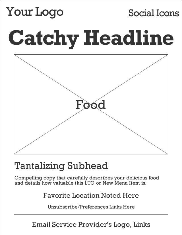
And that starts with ditching the standard email template that just about everyone currently follows. It looks pretty much like this:
Yawn. The basic outline we always see is:
- Your logo and social icons along one row.
- Your catchy headline or offer, designed to suck someone into reading further.
- Your attractive photo of food in an attempt to trigger the reader’s salivary response.
- Your clever subhead to keep the story going.
- Your body copy that details the food or offer and serves as a call to action.
- Your footer links.
And here’s the thing. The outline is predictable — but that’s not always a good thing.
We had a great conversation with Dave Gonyor of That’s Biz that we’ve incorporated into this advice for redefining your email marketing templates. His organization offers hands-on management of email marketing for hundreds (thousands, Dave?) of restaurants in the United States.
1. Think like a direct marketer, not a chef
No offense to chefs, seriously. Featuring your food in a massive photo isn’t a bad thing — you SHOULD be proud of your creations. But each email you send must have a specific action (or actions) you want readers to take in order to drive specific behavior.
And while pictures of your food can be persuasive, they’re not, in and of themselves, a call to action. So, instead, think like a direct marketer.
Be clear about what you want email subscribers to do when they open your email — and ask them to do it. Whether that’s stopping in for lunch and redeeming a specific offer or ordering a specific item; bringing a friend to enjoy a Buy One, Get One; liking your Facebook page to unlock a special incentive; or attending a live event on a specific date.
Grab peoples’ attention, sure, but close the deal, too!
2. Make your emails mobile-ready
We stated in this week’s Restaurant Marketing News post: over 50% of emails are now opened on mobile devices — NOT desktops.
If the system you use to compose your emails isn’t prepping them for easy reading on a smartphone, you’ve got to add a step to your email creation process. Use Zurb’s responsive email templates and start over. Use Campaign Monitor’s free design tool. Ping the account manager with your email marketing services provider to have them fix your template. This step is so very important.
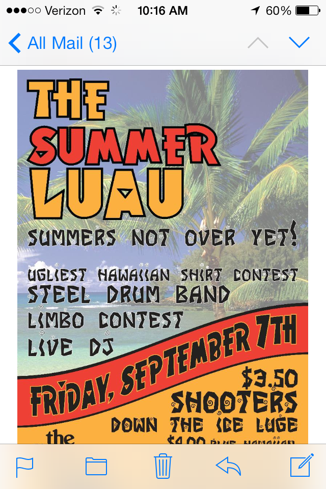
This example from The Greene Turtle fits the bill perfectly. They also do a great job with #3 below.
There’s also a great (non-restaurant) article from Constant Contact about how one firm edited their emails to be mobile-friendly.
3. Make your call(s) to action crystal clear
If you want someone to do something, it’s best to just ask them directly.
And buttons should be buttons.
[nr_button new_tab=true text=”THIS IS A BUTTON” url=”http://nextrestaurants.com/email-marketing/email-marketing-templates-restaurants” color=”green”]
Keeping these two principles in mind are your first two steps to being more direct-marketing minded. There’s another great article we want you to read as part of your transformation in creating better email marketing templates for your restaurant: 7 Things the Great Copywriters Wish You Knew.
In it, Sonia Simone spells out how dangerous is trying to be too clever. Cleverness too often leads to audience confusion.
Another key point about making your call(s) to action crystal clear is to limit how many you’ve got in one email. Do you want people to like you on Facebook….AND follow you on Twitter…AND stop by for that new Southwest Salad…AND redeem a coupon…AND don’t forget you also offer takeout…AND so on? That’s too much.
Limit your calls to action and make them specific.
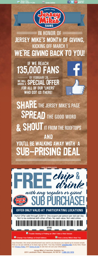
We recently gave Jersey Mike’s a little grief about how their marketing wasn’t well integrated, well, hats off to them with this email that has a very specific request in it, with an offer tied to it:
4. Personalize your emails
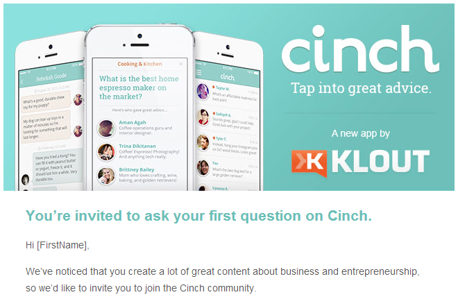
We’ve talked about this before because it matters immensely.
In this age, you can partner with email service providers who will absolutely help you incorporate personalized subscriber components into your email.
This begins with the subscriber’s name (check out the faux pas from Cinch/Klout above). But why not recognize their loyalty status: How long ago did they join? How many points have they accrued? How many points/levels/visits until their next reward?
You can even personalize the subject line, which is MUCH more likely to get your emails opened, by the way.
Transaction-based email is the next step towards fully-personalized emails. It already exists with online shopping. And you may feel you’re a long ways away from this, but it’s on the horizon for restaurants.
There is a time forthcoming when any restaurant who wants to can send emails to guests after a dining experience, detailing what they had, noting how much they spent, and asking for their feedback.
Today, you could start by partnering with a digital receipts vendor and giving guests the option of receiving their receipt via email instead of hard copy. But we digress, we’re talking about email marketing templates here.
5. It’s not just about the food
Make us want to come to your restaurant because it’s a great place to be. The food should be just one, albeit important, part of the guest experience.
Use photos and descriptive language to paint a picture of what it’s look to be in one of your locations. Connect with your email readers. Make us wish we were there, or headed there soon.
Summary
It’s time to rethink your email marketing templates, restaurant owners. Photos of food aren’t enough. Calls to action should be abundantly clear — and limited in number. And remember, your restaurant brand is just that — A BRAND. Communicate with the personality of your brand. Show pictures of what your brand means.
And remember this. If you can generate just a 5% lift in email marketing opens, or clickthroughs, or redemptions, that could be a massive increase in sales if your list size is noteworthy.

