By Jennifer Hahn Masterson, Contributor
You invested a lot into your restaurant’s website. You keep your site updated and the content regularly refreshed, but the number of people enjoying your delicious meals only slightly increased.
But what’s the cause? Most likely there’s something wrong with your website’s design Let’s go through some key restaurant web design steps that you should take to improve conversions.
Optimize Your Restaurant’s Website for Mobile Access

Failure to fully optimize a website for mobile access is one of the biggest mistakes a web designer can do when it comes to eCommerce presentation. Mobile access recently overtook the computer and that gap is only going to grow as the years roll by.
Given the pace of modern life, people make on-the-move decisions using their phones and tablets. If your restaurant’s website is responsive and able to instantly adapt to the size and shape of the user’s screen, it will significantly increase the chances of them eating at your place.
Use the Power of the Landing Page
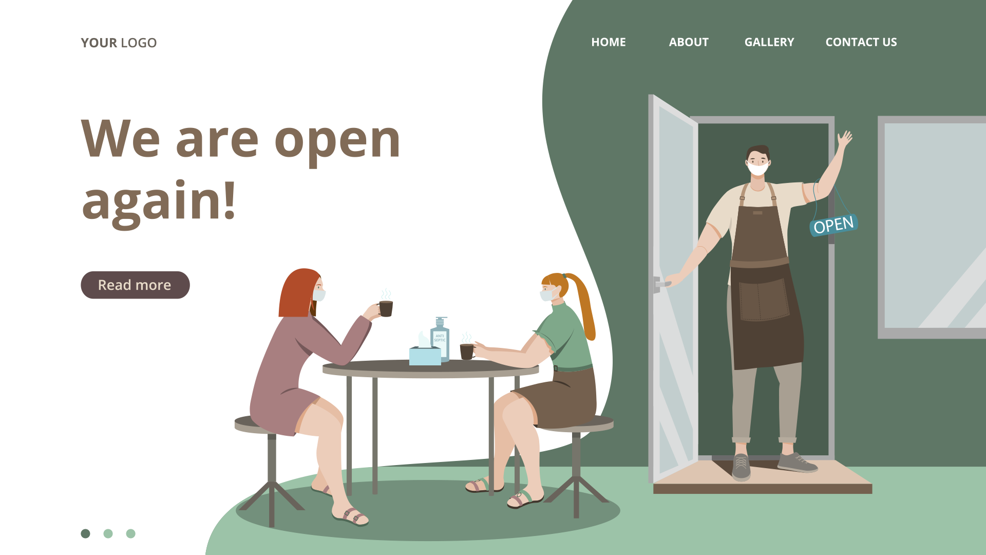
You may have a superbly organized and user-friendly website; still, there is a chance that visitors will fail to notice your site’s features or even special events and offers that are currently being promoted. This is where a cleverly designed landing page comes to play.
Each restaurant marketing offer should feature a single landing page that is designed for a specific target audience. It’s the best way to answer their needs and requests and the fastest way to convert a website visitor into a customer. Eliminate all distractions, focus on a call-to-action, and make it easy for the customers to.
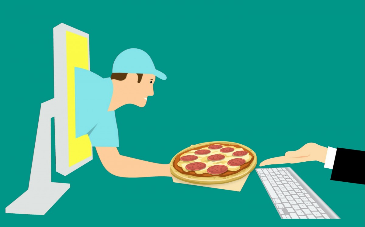
For example, a landing page on a restaurant website could aim to get visitors to book a table, buy a gift certificate, order delivery, or reserve the restaurant for their party.
Simple Website Navigation

Effective web design resides on the fact that skillfully chosen and well-placed details make the difference. Too many things happening at the same time will have a negative impact since visitors prefer websites that are easy to navigate and where the flow of information is easy to follow.
Ensure that the steps your visitors take while browsing what your restaurant has to offer are interesting, constructive, and ask for a reaction because, as this master’s degree in visual design and communication explains, each reaction is usually followed by trade or exchange. For restaurants, that’s following you on social, booking a table, or ordering takeout/delivery.
Include Your Restaurant Loyalty Program
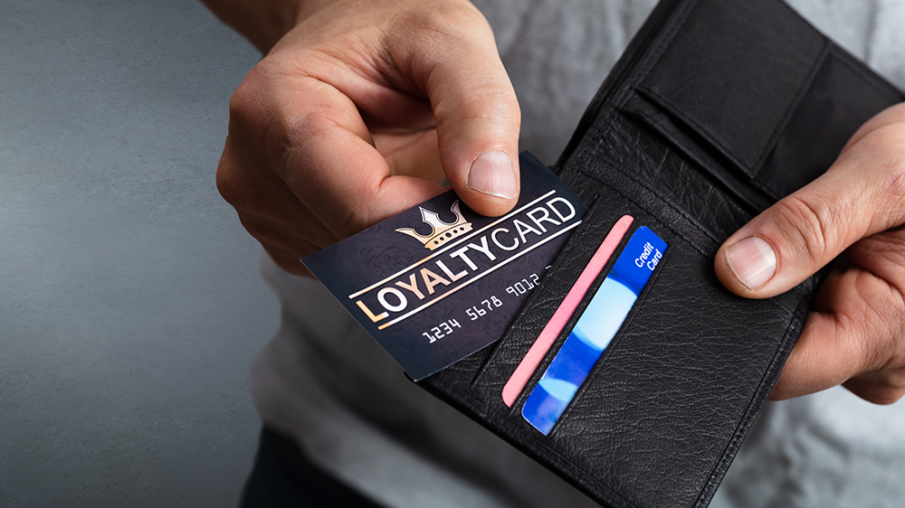
Rewarding customers is one of the safe ways of expanding loyal customers’ base and improving conversions. For example, you could offer discounts, free meals, beverages or desserts, and unique gifts and coupons for your returning customers.
Loyalty programs are also a convenient way of obtaining user data — such as emails, personal profile links, and telephone numbers — which can then be used for additional promotions and notifications. As a result, such direct contacts will also help boost conversions.
Target the Right Customers

The number of social media users has been on a steady rise for a decade now. The staggering number of more than 3 billion users presents an immense opportunity for attracting customers. However, the key to effective conversion is knowing which people to address. It is quite simple: the customers you need to target online have similar tastes in food and interior preferences and belong to the same age group as your regular customers. The web design style you opt for needs to reflect these preferences, as well.
Call-to-Action Button Design
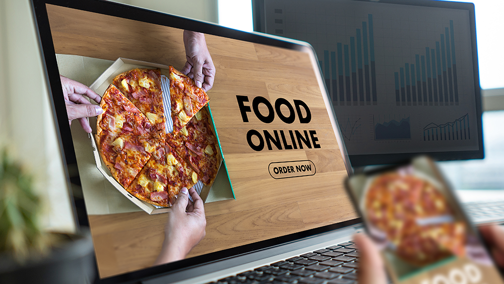
What good are all the efforts you invested in improving conversions if your call-to-action (CTA) button is not adequately designed and immediately noticeable? There is a number of factors that play an essential role in the CTA button design and all of them should be given due notion since clicking this button is the final conversion step.
The most important design elements should be the choice of font and color, as well as the copy written. CTA button needs to be welcoming, inviting, placed in a visible spot, and easy to reach and click on.
Restaurant web design plays a crucial role in converting website visitors into restaurant guests. Simple, intuitive, fast, easy to navigate, and having impeccable mobile device access are usual adjectives satisfied customers use when talking about their favorite online restaurant presentations. Being pleased with what can be seen online, they are quickly making decisions to visit the eating establishment in person. After all, this is ultimately what you are looking for as a restaurant owner.

About the Author:
Jennifer Hahn Masterson is the Lead Content Strategist at Spread the Word Solutions, holding an MA degree in business communication. She is always doing her best to help her clients find their place in the ever so competitive business arena, insisting on long-term sustainability rather than on some questionable get-rich-fast scheme. You can check her out on LinkedIn.

