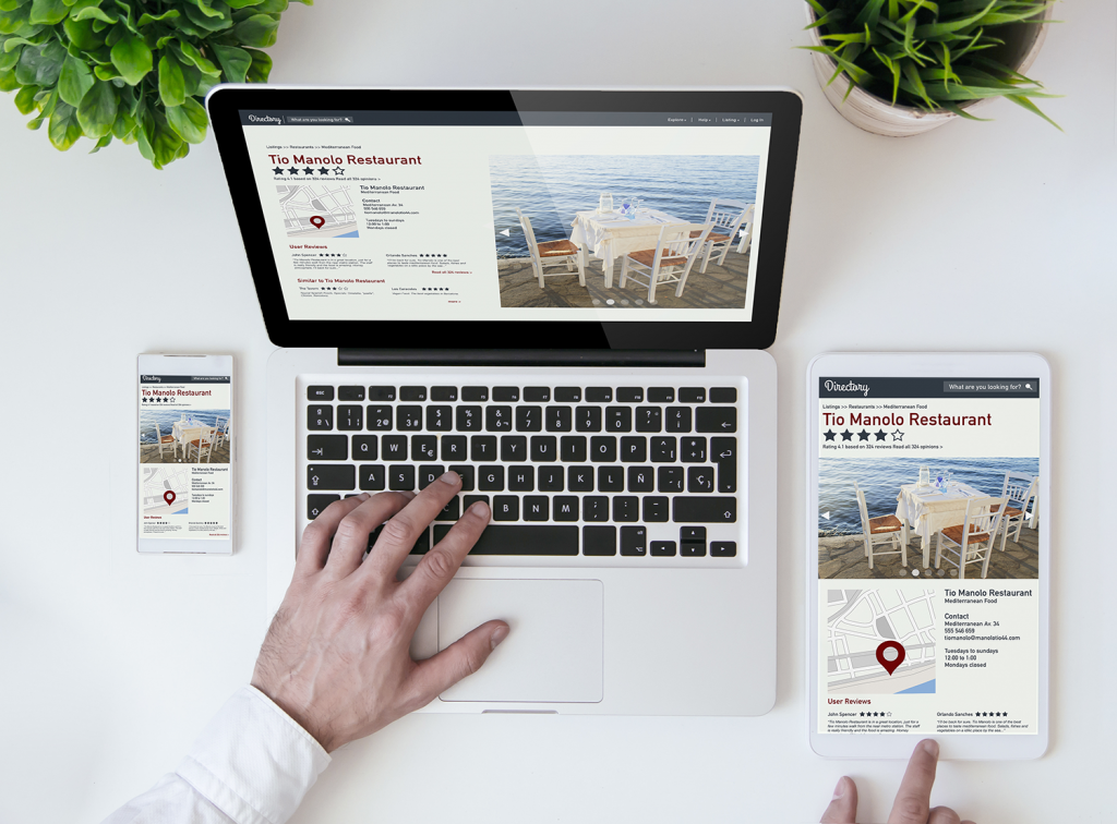
Restaurants need good looking websites. It’s no longer excusable to just have your menu on Yelp or AllMenu.com or some similar third-party site. You need to have a website AND it needs to look good. If you built your website over a decade ago, it needs to be redone and updated.
How you design your website and the choices you make for it will impact everything in your business. It can influence what items get ordered more often, get you more customers on a regular basis, increase the number of returning customers, and reinforce your brand. But where do you start? What choices do you need to make to properly design a restaurant website? Here are some pointers to get started with.
Aligning Your Website to Your Branding
Before you start making any kind of design choices, you need to be aware of your current branding, how you want to grow/change it, and how a website will fit into that. Your website is basically a digital version of your restaurant’s dining experience, and it needs to reflect what your customers should experience. If your website looks like it belongs to a five-star fancy restaurant but it really is just a biker dive bar, people are going to be confused. Your branding needs to be the same across all marketing and in-restaurant experience.
If you want to take your restaurant’s branding in a new direction, a website can really help out with that. It’s the perfect time to make changes, and then reinforce that new look online.
The first choice you really have to make is your website’s color pallet. Your website needs to look like it belongs inside of your restaurant. If colors play a big role in your restaurant’s mood or feel, use those colors or similar ones on the website. A brunch place full of yellow, bright colors and natural light shouldn’t have a website with a black background.
Similarly, if your restaurant has a theme or focus, the website needs to reflect that too. Trying to provide an authentic Japanese experience, both with food and atmosphere? Your website needs to capture that vibe. Want to create nostalgia for the ‘80s with your new hamburger joint? Your website, both with colors and content, needs to provide the same.
Taking Good Pictures of Food for the Menu
Understandably, most restaurants don’t provide pictures of their food on their printed menus. For some, it’s a matter of space, for others, it just looks tacky. Images, though, are a key part of webpages, and your online menu needs them.
Ideally, every single unique item on your menu should have its own page and image. That way, if they click on a certain item on your digital menu, it provides them with an image of the food and a detailed description. If people are doing research on your restaurant or specific items, you can provide necessary information. Important information can include: common allergens in the food like peanuts, if it’s vegetarian or vegan friendly, ingredients, calorie count, and how spicy it is.

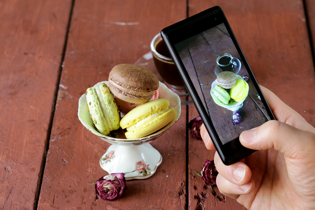
Now, pictures are going to play a huge part in attracting new guests, so be sure they are well done. Don’t just snap a photo with your smartphone and slap it online. The reason food looks so good in commercials but doesn’t look as appetizing in real life is because they hire professionals to make mock versions of it. You don’t need to go so far as to create plastic versions of your food, but you should consider hiring a professional photographer to help take the photos.
If you don’t want to hire a pro photographer, then at least invest in a nicer camera and learn Photoshop. When photographing your food, make sure you have lots of natural lighting, find a way to stabilize your camera, shoot in RAW, and arrange the food so it looks appetizing. Try and remove unsightly juices from the food, and remember it doesn’t have to be warm for photos. Steam could throw off the look of the food, but if the food develops a greasy appearance when cold, try to find a good middle ground for it.
Then, after you take photos, go into Photoshop and edit them up to look nicer. Edit out unsightly things you notice later, make slight lighting adjustments, and make the photo look more professional. You can do a lot with Photoshop, but life is a lot easier if you just take great photos to start out with. Don’t rely on editing the photos too much or it might end up just looking unnatural.
Easy to Understand
A good restaurant website doesn’t need to be complex. A home page, your menu pages, the “about us” page, contact page, and if you offer it, an online ordering function, is all you need. Don’t fall into the temptation of making your website overly large or complex. A simple website means less chances for visitors to get confused and leave. Navigating between pages should be simple and getting back to the homepage and menu should always be a single click away.
As long as you remember to keep the layout of your website simple, have it reflect your restaurant’s branding, and include high quality photos of your food, your website will definitely work out for you. The next step is making sure you push your marketing, so you can attract people to your website, and subsequently, your restaurant.


